
rebranding project for the Redmond campus employee store relaunch with public inclusion — still image of a super slow-moving motion graphic: the arcs come into focus as they drift from the left to the right, never dissecting the MS logo, only appearing with harder focus under "company store" and to the right; highlights run down invisible edges, like drops on an oil lamp. There's a little more about this here — creative direction - scott j bailey, agency - PBJS, Seattle

an iPhone/iPad app, learn more here — concept, name, writing & design by scott j bailey

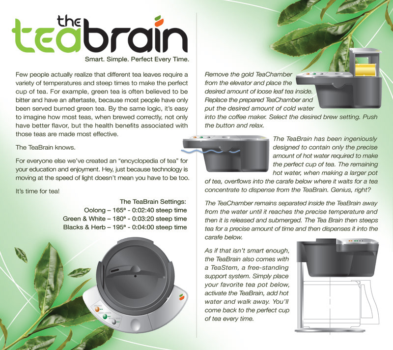
a social network, learn more here — name & design by scott j bailey
as seen on ABC's American Inventors — name, writing & creative direction by SJB
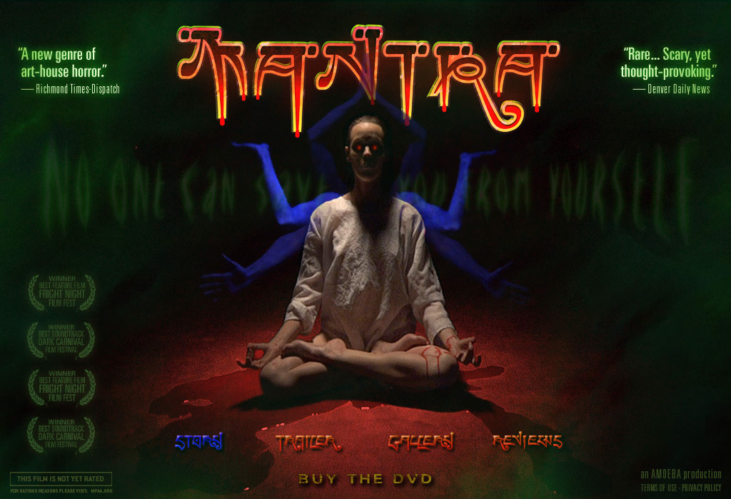
indie film title graphic, website, & DVD cover (below)

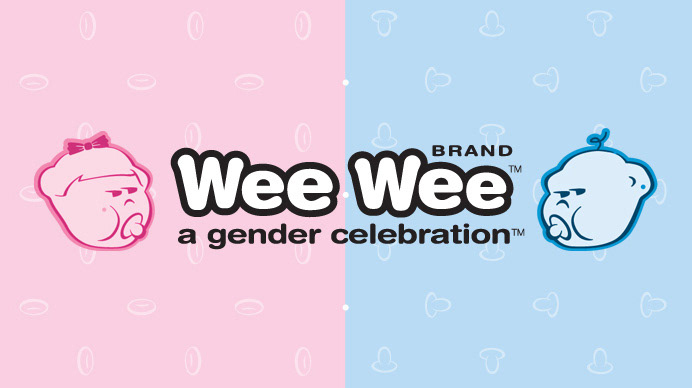
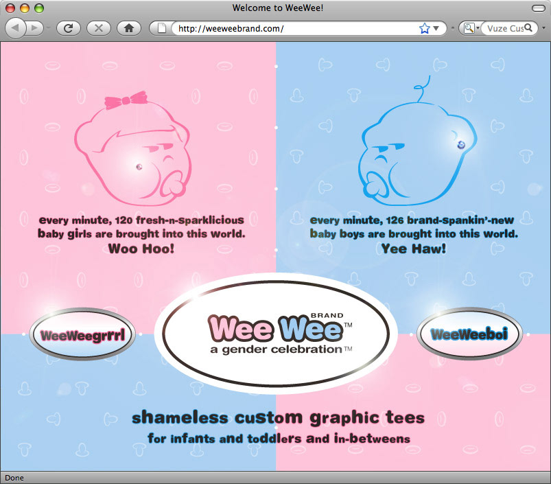
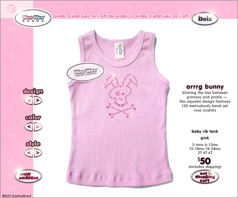
an edgy line of gender-obvious infant apparel — name, writing & designs by SJB

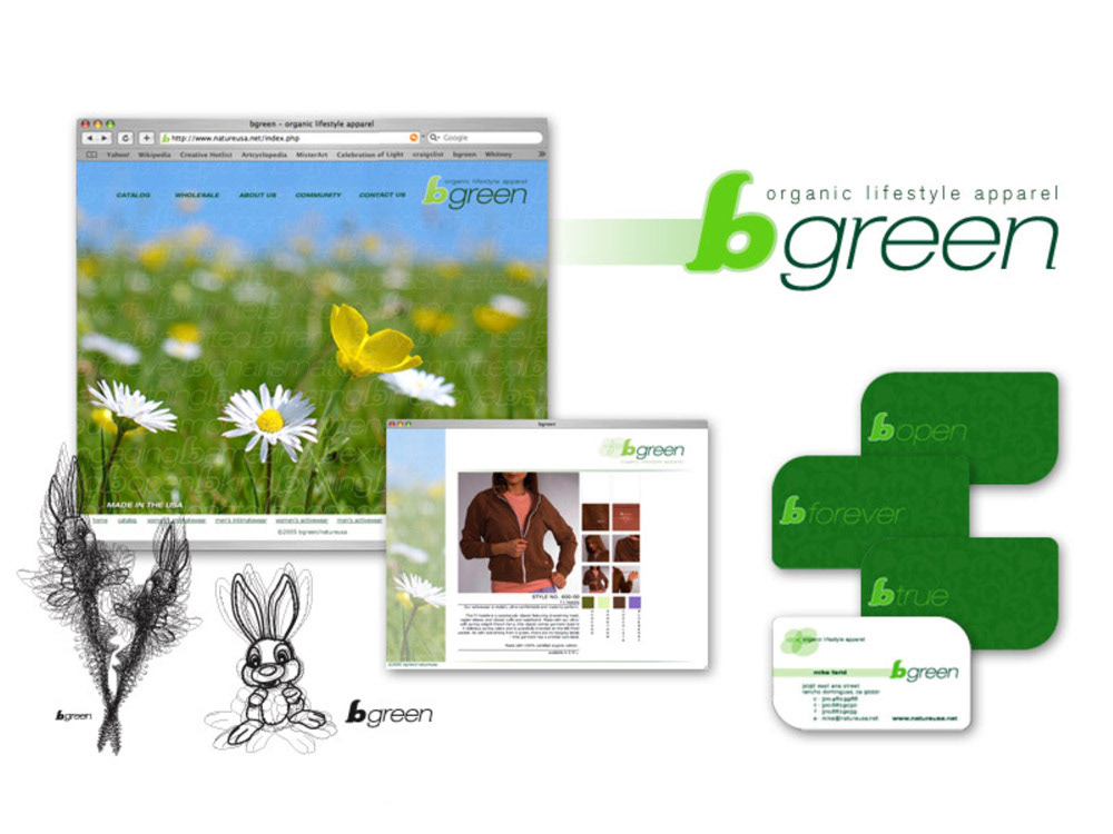
organic underwear and activewear manufacturer — designs by SJB

a digital artist's signature and initials, learn more here — name & typographic design - SJB

a children's card game — writing, design, & illustrations - scott j bailey

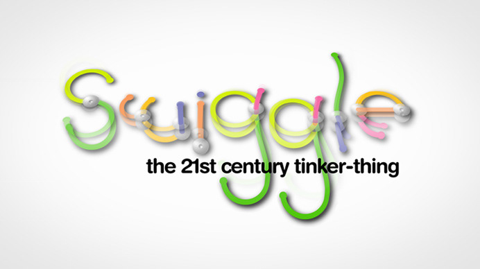
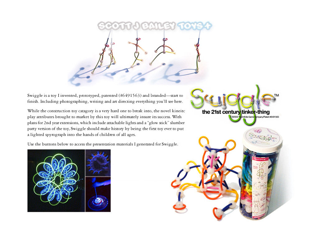
a silicon rubber 'construction' toy— concept, name, writing & designs - SJB
a line of hand-made botanical soaps, deep sea salt scrubs and other self-care products — SJB
an art collective — name & warner jensen 'cube test' concept by SJB

ethisphere's seals of approval — design - scott j bailey
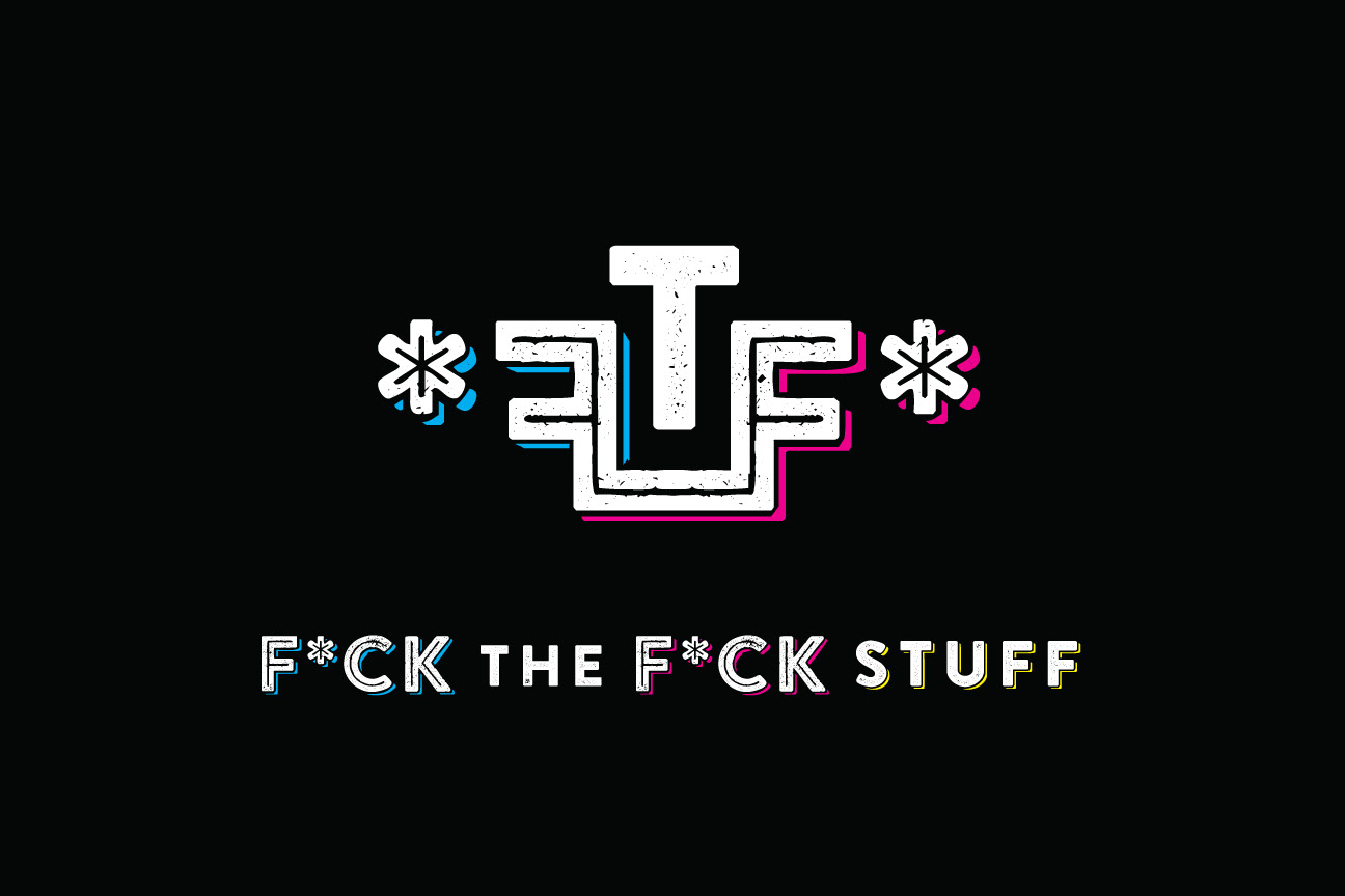
FU teeshirts with attitude — design by SJB

kaleidoscope video iPod attachment — design by SJB

still from motion graphic title for a documentary film about sugar consumption

vampire repellant - a fine arts & crafts project, see more here — design & illustration by SJB
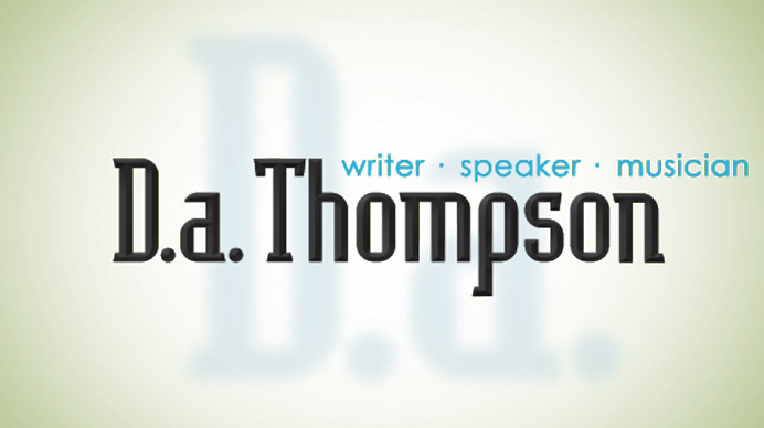
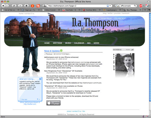
a human being — typography & web design (below) by SJB

a startup in Spokane, Washington — typography & design by scott j bailey


an app development firm — design by SJB